Appearance
Table chart

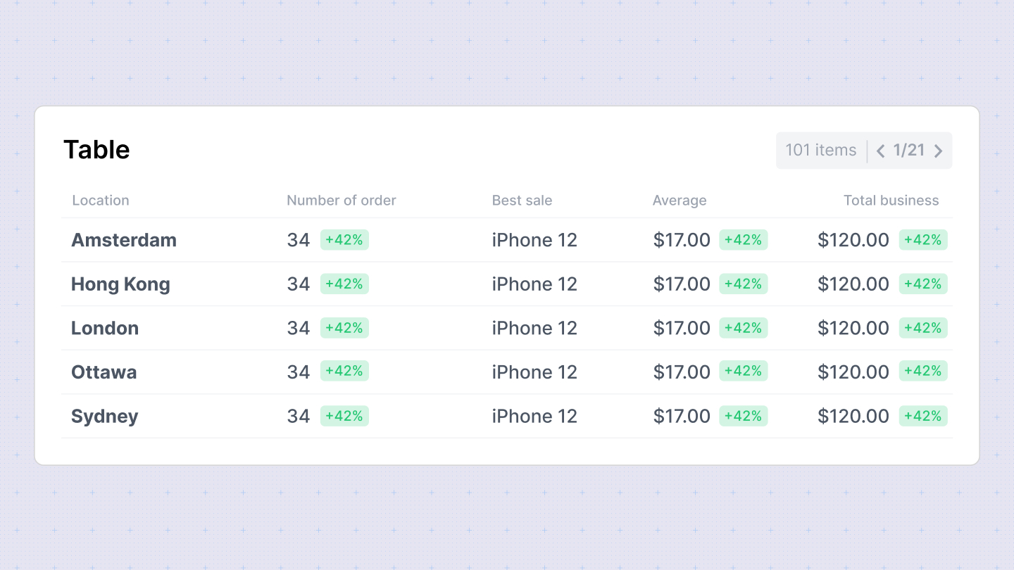
The Table Chart in Sumboard provides a structured way to display tabular data, making it useful for presenting detailed information and comparisons within your dashboard.
In the configuration sidebar, you can customize the following options:
- Chart title: Add or disable the chart title for clarity.
- Columns: Choose which columns to display from your dataset. You can reorder them as needed.
- Column settings: Customize each column's title and data type (Date/time, number, currency, percent, string, duration).
- Column alignment: Align columns to the left, center, or right for better readability.
- Grouping: Group columns under a parent to organize data hierarchically.
- Calculate totals: Enable to calculate totals for numeric columns, providing summary insights directly within the table.
Column type options
- Number: Specify the number of decimal places to display.
- Currency: Define the currency placeholder (default is from workspace settings).
- Duration: Choose the duration style: Narrow, Short, or Long, for displaying specific time durations (e.g., "3 seconds").