Appearance
Doughnut Chart

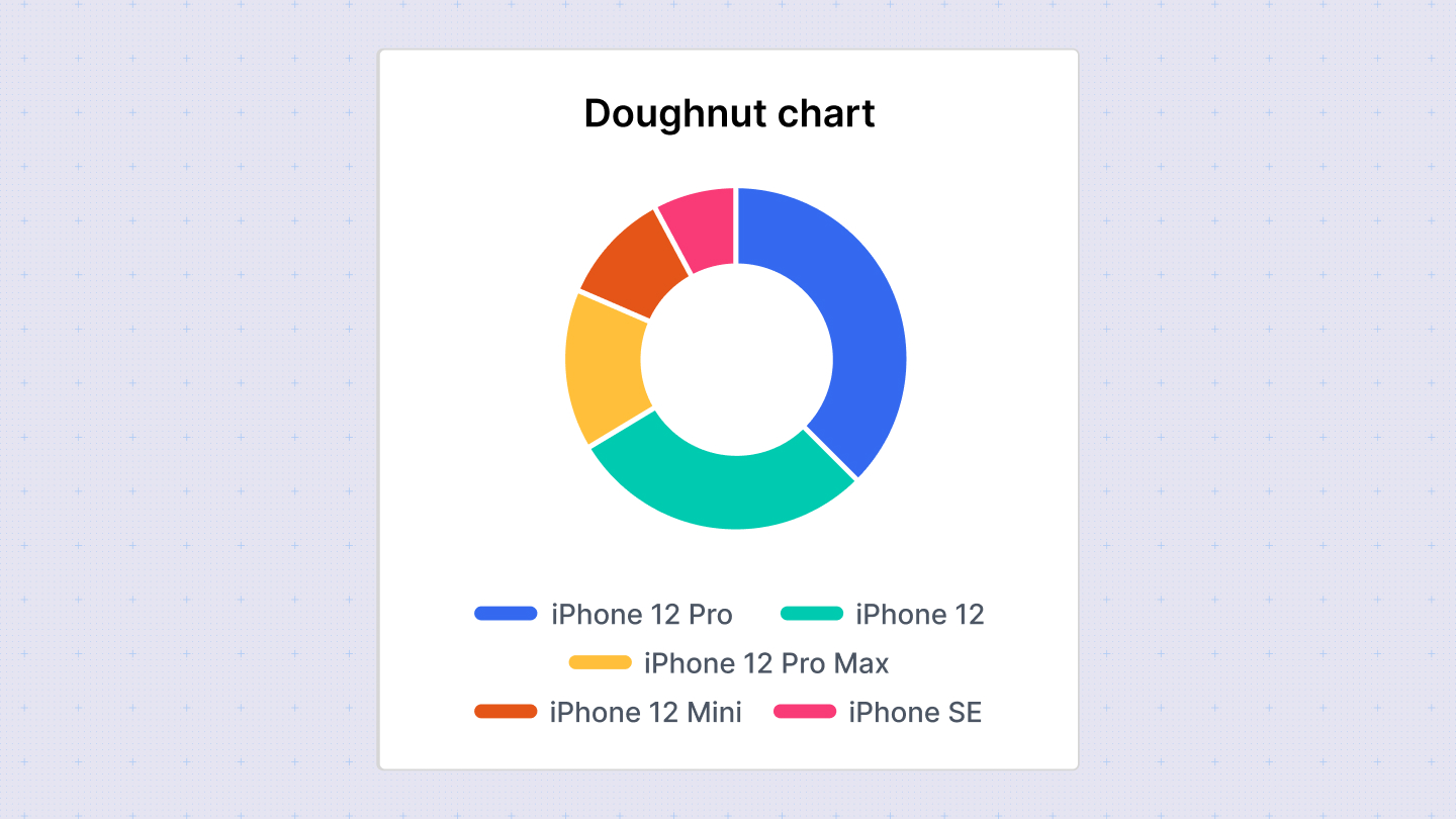
Doughnut charts are similar to pie charts but include a hole in the center, making them visually distinctive. Like pie charts, they are effective for displaying proportions of a whole where each segment represents a category's contribution to the total.
Configuration Options
Customize the doughnut chart using the following options in the configuration sidebar:
- Chart type: Switch between different chart types to visualize your data. Sumboard will map the columns based on its best guess.
- Chart title: Add or disable the chart title to provide context to your data.
- Value: Select the column containing the values for each segment of the doughnut chart.
- Label: Choose the column that provides labels for each segment.
Column Type Options
- Number: Define the number of decimal places to display.
- Currency: Specify the currency placeholder (default is set in workspace settings).
- String: Display labels as text.