Appearance
Bar Chart

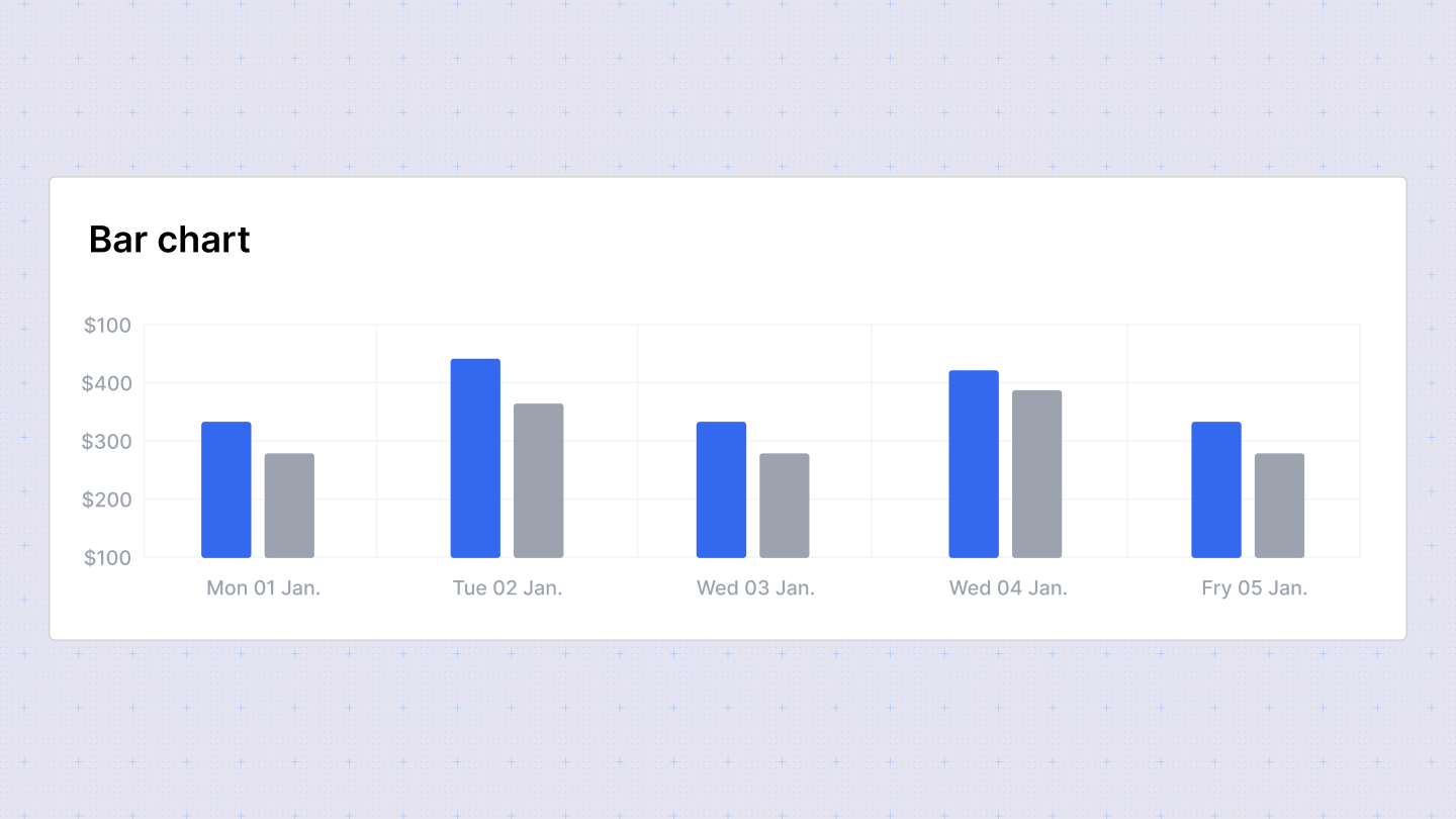
Bar charts are ideal for visually comparing data across different categories. They use rectangular bars where the length of each bar corresponds to the data being represented.
Configuration Options
In the configuration sidebar, you can customize the bar chart with the following options:
- Chart type: Switch between different chart types to visualize your data. Sumboard will map the columns based on its best guess to build the visualization.
- Chart title: Add or disable the chart title to provide context to your data.
- X-axis: Select the column to display on the x-axis. You can enable multiple columns for comparison.
- Y-axis: Choose the column for the y-axis. Only one column is allowed for the y-axis.
- Column titles: Customize the titles of the columns displayed on the chart.
- Column type: Choose from Date/time, number, currency, percent, or string for each column.
Column type options
- Number: Define the number of decimal places to display.
- Currency: Specify the currency placeholder (default is set in workspace settings).
- Duration: Select the style for displaying duration: Narrow, Short, or Long. Duration types are used for displaying specific durations (e.g., 3 seconds).
Grouped Bar Chart
The grouped bar chart variation allows you to select both row and column dimensions instead of traditional x and y-axis settings. This flexibility enables you to compare data across multiple categories within each group.